

It is typical to look at UX as yet another bucket of deliverables in software projects. You deliver good source code, good documentation, good UX, good training. And there are awesome UX professionals who work hard in partnership with the functional and tech teams to fill the yawning gap. They define the persona, do the user journeys, fill up wall-length whiteboards with indecipherable scribbles on Post-it notes (why are Post-it notes such favourites of these UX chaps?), and mumble about task flow and what not.
My tone may be light-hearted, but I have nothing but respect for UX professionals. I think they bring immense value to application design (someone taught me the term “service design”, and I like that term more), and we engineers are totally blind as bats without the sensitivity which UX brings in.
But sometimes, I feel that there is a dimension of UX which is so fundamental that it’s not about all these analyses and personas and flows – it’s about caring about humans. UX pros may argue that this is precisely the caring which UX pros bring to the table with all the hard work they put in, but I often do not see this caring in the UX which emanates from the final system. Maybe it’s supposed to be part of the output, but I have often found it absent. On the other hand, I have seen UX so beautiful and in such simple situations that I felt that this may have nothing to do with persona and user journeys and task flows.
I’ll just give some examples, one bad, two good. First, the bad.
UX trauma with SBI
This is the login screen for the SBI retail netbanking portal.
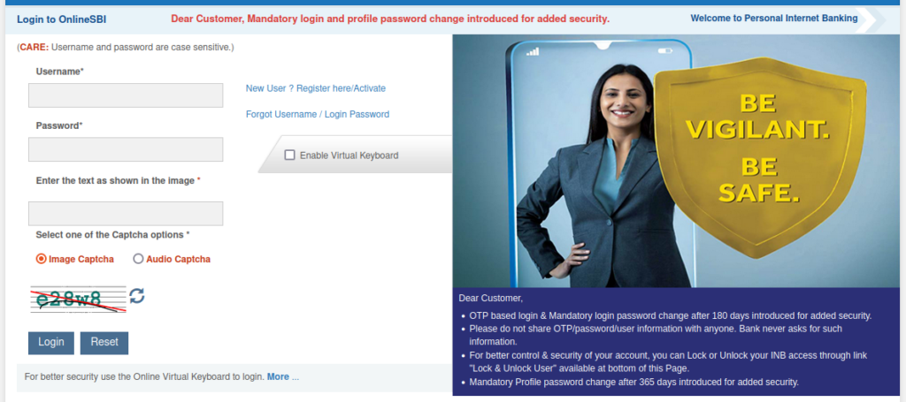
Nothing remarkable here. I log in, then I do some work, then I forget to log out, and then when I get back to the screen after several minutes, I get a message saying I’ve been logged out due to inactivity, and I must “login” again. The word “login” is hyperlinked, and when I click on it, I come back to this login screen. So far so good.
But when I enter my credentials, and click on “Login”, I am told that I have been logged out the last time due to inactivity, therefore I must wait five minutes before I can log in again. I find it stunningly poor design that the portal shows me a form, allows me to enter my credentials, allows me to click on “Login”, all the while knowing that if I attempt to log in, I’ll be thrown out. Shouldn’t the portal show this information a priori, as soon as I come to the login screen, telling me to wait five minutes? Or better still, shouldn’t my re-login attempt itself alert me to wait before I am brought to a fresh login screen?
This is not unique to just the time-out login process. There are many other operations I have attempted with the SBI portal which have the same “feature” – they allow me to fill form after form online, click from one screen to the next, and then on the third screen, their portal will tell me that the operation I am attempting cannot be performed for some XYZ reason. They knew this constraint right at the beginning of the first form, but they will not inform me till I actually complete the entire sequence of form-fillings and click the final button on the third screen.
Why do their systems behave this way? Answer: they show an engineer-first design, not a UX-first one. Their engineers write code like, well … engineers. They gather all the inputs (the techie calls them “fields”) from me (they call me “the user”), and finally, when I click the final button to actually attempt the transaction, they do all their process checks (the techie calls them “validations”) and kindly inform me that my operation is rejected. In the process, I suffer UX trauma.
The UX-sensitive way to build this screen would be to make a web service call at the first point when I am about to go to Screen 1, and check whether the system will permit me to proceed or not. For instance, for funds transfer on SBI Netbanking, I go through a Screen 1 where I select IMPS, or NEFT, or RTGS. Then I go to Screen 2 where I enter debit account, credit account, amount to be transferred and other details. Then I am taken to Screen 3 where I am shown all the details I have just entered, and am asked to confirm my intentions. And then, finally, after I confirm, I am told that my daily limit for funds transfer via netbanking has been reached, and no further transfers are permitted.
The system should have made a web service call on Screen 1 and told me “If you wish to proceed with funds transfers, you will not be permitted, because you’ve reached your daily limit.” But this extra web service is deemed an unnecessary piece of code by the engineer. He can deliver the same functionality without the extra web service call. Who cares if the user gets UX trauma?
SBI is one of the largest banks in the world, and their IT budgets too will be proportionate, I’m sure. Their tie-up with TCS as a technology partner, their re-branding with the help of Accenture for a more friendly retail face (the much-vaunted “SBI InTouch” initiative), their work with IBM to build the Yono super-app, are well known. There is no dearth of budgets, management decisions or technology expertise. But the UX which comes out of all this shows a lack of that one word: caring.
Let’s move to more cheerful stories.
Entering a phone number on Android
We keep our contact details in Android phones. Try entering a phone number.

This is what happens after you type in these digits. Then, as you type further:

The system has entered a space after “22”. This is not done blindly. See what happens if, after the “+91”, you had entered “98-something”:

Android is not entering a space blindly after the first two digits. It is actually analysing those digits, and when it sees “22”, it knows that the area code 22 (Bombay) is complete, which means that the next digit will be the start of the phone number, therefore it inserts a space after the “22”. If on the other hand, you enter “98-something”, as shown above, Android knows that the “98” is not an area code, it is the first two digits of a mobile number. In that case, as you type, it waits for five digits, and inserts a space only after five. See what happens if you enter a complete Indian mobile number:

The space after the “98208” has been inserted by Android. It believes that a 10-digit Indian mobile number needs to be formatted in 5+5 format.
This UX allows the user to see, in a quiet, unobtrusive way, whether he’s entering a landline number or a mobile number. And with landline numbers, it tracks which area code you are entering. See what happens if you happen to enter a Latur landline number:

Here, Android tracks that I have entered “23” instead of “22”. It knows that the area code is not yet complete, therefore it does not insert a space after “23”. It does not insert a space blindly after two digits — it studies what I’m doing, almost as if it’s watching my every keystroke. It waits for me to finish the entire area code, tracking each digit. When I finish “2382”, it concludes that I have entered the Latur area code, and then it inserts a space. And since Latur landlines are six-digit, it breaks up the local number into 3+3. It knows that Bombay landline numbers are eight-digit, therefore it breaks up Bombay numbers into 4+4, as shown below.

In all the examples above, the spaces have been inserted by Android, not by “the user” (me).
One must not assume that Android has decided that all mobile numbers need to be formatted in a 5+5 format. In the US, the area code and phone number are all combined into a 10-digit sequence, and formatted in 3+3+4 format with hyphens, not spaces. That is how Americans like to see their phone numbers. Android takes care of regional preferences:

So, on the one hand, we have SBI, which can let me navigate entire screens while the software chews its paan or khaini, and when it finally gets the nudge it can no longer ignore (in the form of a “Confirm” button), it tells me that I’ve wasted the last two minutes of my life. On the other hand, Android follows each keystroke and silently nudges me with the added guidance of the formatting of my half-finished phone number.
Now to my third story, also on Android.
Missing a call, Android style
On Android, if your phone receives a call and you don’t pick up, you are shown a notification telling you about the missed call. But if your phone had Do Not Disturb on at the time, this is the message you see:

Yes, Android correlates the fact of the missed call with the fact that the phone was on do-not-disturb at the time, and its notification actually tells you this. (This was not there in Android a couple of years ago — I’m on Android 14 now.)
I find this extremely touching. This shows a degree of caring for my well-being which is above and beyond what I signed Android up for. Android knows that it’s possible that I may not like to miss calls unwittingly, because I may have left my phone on do-not-disturb even after my last meeting ended. So it actually gently nudges me to correct this mistake, if it was a mistake.
Have you ever seen a business application which points out your error but also gives you a possible reason why you may have made the error inadvertently? If you have seen it, it’s probably not a portal of an Indian public sector organisation.
UX is about caring
I have heard UX experts tell us about their long and thorough process when they dive into a new UX project. They put in a lot of effort to understand how each user profile thinks and feels when using each screen, each field. They then use this understanding to deliver an experience so intuitive that we no longer need user manuals. I accept the value of what they bring to the table.
But when I see the kind of UX which SBI gives me, I don’t think any UX designer in the world could have compensated for the utter insensitivity of the engineers who build these systems and the managers who sign off on their acceptance. Either the SBI management selects UX consultants based solely on L1 criteria (“L1” means the bidder who has quoted the lowest fees), or they get UX inputs from their UX teams and then summarily ignore them when they build their systems. I have lived all my life in India, and I have experienced the utter insensitivity and callousness of sarkaari organisations towards customers, users, and applicants, all my life. (I once flew 2.5 hours in an Air India flight where the air hostess blithely announced soon after takeoff that all three lavatories were malfunctioning and would be kept locked, and “Inconvenience is regretted.” I cannot imagine what kind of callousness makes the Air India crew believe that all passengers can casually tolerate this kind of situation — that aircraft should not have taken off in that state.) I see exactly the same callousness in the SBI netbanking UX, brought forward into the 21st century.
And when I see these two Android UX examples, I don’t think these quiet, unobtrusive features came about due to some million-dollar UX exercise or due to some new research into how their users use their phones. It came out of a constant struggle to refine, evolve, and listen to how users think and feel, how ordinary humans struggle. I believe they came out of caring.
Leave a Reply